Ryu Keiretsu Sidebar
- Main Article: Ryu Keiretsu
- Organization: Corporations
- Faction: Yamatai Star Empire
- Clan: Ryu-Mizumitsu Clan
- Samurai: Mizumitsu Samurai
News
Corporate Security
Corporations
Holding Company/Financial
Industrial
Non-Industrial
Holding Company/Financial
Industrial
Non-Industrial
Below is a guide to the design philosophy of the Ryu Keiretsu (RyuK). It will be useful for anyone interested in developing a design under a corporate brand within the Ryu Keiretsu. As as well as explain why a design was made the way it was compared to existing design styles within the sector.

When someone sees a product from the Ryu Keiretsu, there is always a sense of cold, threatening formality when seen. They can make anyone, be it a Nepleslian gang member, a Nekovalkyrja soldier, or a Helashio miner, respectable in the eyes of others. So long as they act the part at least.
RyuK products in addition to the psychological component, products focus on being multi-purpose and extending their capabilities with technology. A Megumi Environmental Skinsuit on its own is simply an environmental suit. But when attached with scientific equipment and a something like the Isolated Computer Pad, it can make the user a mobile lab for on the scene analysis.
One phrase can sum it all: “Look cool and be cool.”
Ryu Keiretsu designs emphasize the motto “Substance over Style” where products tend to have a cold, threatening elegance and formality, highlighted by the visible presence of militaristic accents. Products must be forceful, functional and high-quality rather than flashy.

All corporations of the Ryu Keiretsu have their own branding colors (detailed later in this article). But only three of them are largely visible due to either the ships they operate or the equipment their employees wear. These coloring schemes are detailed below.
Takeda Minerals and Mining employs a vibrant color palette in their design philosophy. A dominant use of orange and white is chosen to bolster safety and enhance visibility, essential considerations for an industrial setting.
Trims of dark and light blue are integrated into the designs to imbue them with a sense of dynamism and vitality. Their logistics ships and mining products generally adhere to the keiretsu's color scheme, although they replace the standard gold with white to better align with their safety-first approach.

Black Crane Securities also has their own palette schemes, one for normal work conditions, one for combat conditions, and one for their combat craft.


Ryu Shipping Lines exemplifies the Ryu Keiretsu's design philosophy of “Substance over Style,” ensuring that their operations are not only efficient and reliable but also exude a sense of elegant professionalism and respectability.
Visual design of products are a mixture of blockiness, sleek curves, and aggressive angles. Products are designed passively tell others you are prepared for a fight/work. The following are links to image galleries that fit the desired feel for various RyuK products.
OOC: Do not actually use them in RP.
RyuK fashion have a sleek and domineering aesthetic with militaristic components.
Power Suits (such as environmental skinsuits) are often designed to serve as the base for a larger system. They are also designed to restrict as little mobility of the user as possible, allowing them to be both form-fitting or loose (giving the user freedom of choice). The neck is often covered by the suit and the chest often has extra material over it to protect modesty/add protection to vital organs.
Power sources are often located at the small of the back.
Currently the Ryu Keiretsu does not possess a power armor design. But from prototypes and simulations developed by engineers, the RyuK emphasizes a mixture of Nepleslian bulkiness and Yamataian curves. They always incorporate a power suit that serves as the core (providing life support functions) of the power armor.
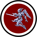
Prototypes developed by Ryu Heavy Industries continue the trend started with power armor with a mixture of blockiness and curvature with a cold threatening eloquence. They are intended to bring awe from your opponents and intended to be on the front lines.
Prototypes again emphasize substance over style, preferring to stick on traditional aerospace fighter designs to ensure maximum utility. But where it is possible without ruining its function, aggressive angles and lines can be found.
Vehicles continued the RyuK look. Important areas that require the most protection tend to be blocky, while curves are added for additional armor or at less critical areas.
Aerospace share the same look vehicles have. Important areas that require the most protection tend to be blocky, while curves are added for additional armor or at less critical areas.
Materials used should provide the maximum protection/functionality to a product. Osmiridium is a popular material due to their license enabling them to produce it in-house. When heavy armor is required, Nerimium is used.
Ryu Keiretsu is a practical corporation, with a product naming scheme reflecting the intended audience. Product names primarily employ Lianjia Speech, Korean, and Yamataigo (邪馬台語) words, focusing on natural, mythical, and morality-based themes.
Components
Civilian Craft/Vehicles
Civilian Products
Military Craft, Vehicles, and Armors
and seasons/weather phenomenon.
A company's branding kit is a crucial element of its corporate identity, encapsulating the essence of the organization's mission, values, and services. Even in sectors where aesthetics may seem secondary to functionality, a carefully curated branding kit can convey professionalism, instill trust, and differentiate the company from its competitors. Here are the branding kits of several corporations:
Advancer Enterprises' branding incorporates a Lochivar Green (#378684) as the primary color, symbolizing its commitment to health and well-being, while white (#ffffff) acts as the secondary color, reinforcing the concept of purity and cleanliness. The tagline, “Advancing Health, Enhancing Life,” succinctly communicates the company's mission. The logo, featuring two stylized A's, one nestled within the other, represents unity and mutual support, underlying the collaborative spirit at the heart of the organization.
Black Crane Securities opts for an authoritative black (#101820) as its primary color, instilling a sense of security and solidity. The secondary color is San Juan Blue (#344d66), a hue that exudes trust and reliability. The company's tagline, “Security in Certainty,” underlines its commitment to providing stable, reliable security solutions. The logo depicts a black crane in flight within a circle, signifying freedom, protection, and vigilance.
Fuji Corporation uses a deep Eggplant (#5D4157) as its primary color, denoting its maturity and experience in the market. The Soft Sky Blue (#A8D8EA) secondary color signifies openness and opportunity. The company's tagline, “Bridging Markets, Empowering Trade,” embodies its role as a facilitator of commerce and international trade. The logo, a stylized depiction of a snow-capped mountain, mirrors the company's resilience and its aspiration to reach new heights.
The Fujiko Development Corporation employs a striking Maroon (#800000) as its primary color, representative of its close ties to the Nepleslian Reds. Its secondary color, a soft Champagne (#F7E7CE), underscores a sense of optimism and economic prosperity the corporation seeks to foster. The tagline, “Empowering Unity, Inspiring Progress,” encapsulates the corporation's mission to improve the economic and governance situation of the region, fostering unity and progress. The logo, two interlocked tricolored triangles, speaks to the interconnectedness of the region's diverse entities.
Ryu Heavy Industries' branding scheme features Cherry Blossom Red (#B02E0C) as the primary color, hinting at its Yamataian origins and symbolizing the company's strength and vibrancy. Light Gray (#D3D3D3) serves as the secondary color, indicating the firm's balance between innovation and practicality. The tagline, “Strength in Innovation,” underscores its commitment to developing groundbreaking industrial solutions. The logo, a stylized dragon coiled around a beam, embodies the company's enduring strength and its quest for perpetual innovation.
Ryu Shipping Lines makes use of Lochmara Blue (#017ac3) as its primary color, denoting the company's vast reach and solid reliability. Purmice Silver (#c5c8c6) is the secondary color, reflecting the company's modern, technology-driven operations. The tagline, “Delivering the Future, Today,” emphasizes the company's commitment to forward-thinking logistics solutions. The logo, an abstract design of waves and a ship, encapsulates the company's core business and its connection to transportation.
Sakura Bank and Trust uses Deep Indigo (#2E294E) as its primary color, exuding an aura of wisdom, trust, and financial stability. The secondary color, Gold (#FFD700), symbolizes wealth and prosperity. The tagline, “Trust in Growth,” underscores the bank's mission to foster financial growth and stability. The logo, a stylized cherry blossom enclosed within a Lianjia-style gate, emphasizing safety and prosperity.
Sakura Machinery's branding employs a commanding Totem Pole Red (#990000) as the primary color, symbolizing the company's commitment to power and precision. Gold (#ffd700), the secondary color, underscores the high value and quality of the company's products. The tagline, “Precision Crafted for Tomorrow,” highlights the firm's focus on meticulous craftsmanship and forward-thinking innovation. The logo, a stylized cherry blossom incorporated into a cogwheel, reflects the company's roots in manufacturing and its dedication to precision.
Takeda Minerals and Mining uses Big Stone Blue (#1f2f3f) as its primary color, resonating with the company's operations in extracting valuable resources from the earth. Cerulean Blue (#00a3d5) serves as the secondary color, symbolizing the clarity and value of the company's products. The tagline, “Unearthing Value, Powering Progress,” expresses the company's mission to discover resources that drive societal advancement. The logo is a geometric, diamond-shaped design, with a stylized pickaxe, which embodies the company's core business.